02 / 07
GlyphGAN
- PyTorch
- Python
- DCGAN
https://github.com/latentcollection/glyph-gan

A network trained on letterforms, where the output is not a letterform but the space between two of them.
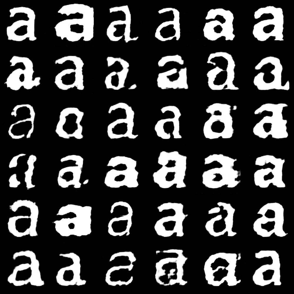
A GAN pairs a generator that turns a random vector into an image against a discriminator that tries to tell the generated ones from the real. Train them against each other and what the generator is left with is a continuous space of letterforms — which can then be walked through rather than sampled. The video is the work: one letter becoming another through shapes that sit between real typefaces and are not any of them.

The dataset is the project
Training a model on typography needs thousands of images of the same glyph in different faces, and no such set exists in a usable form. It has to be made, and how it is made determines what the model learns.
A single letter gives a model of that letter’s design space and interpolates cleanly. Training on all twenty-six without conditioning averages them into mush.
And a font collection is far less varied than its file count suggests. On the machine this was built for, 3,639 faces came from 654 families — GT America alone accounted for seventy of them, Minion Pro sixty-four. Train on that and the model learns whichever families you happen to own the most weights of. Capping the dataset at three faces per family, spread across the weight range rather than taken in file order, cuts it to 1,405 and removes the skew.
That is what fontscrape exists for.


Tofu is what a face draws when it has no glyph for the character asked of it: the .notdef
placeholder box. It is not a letterform, and a few hundred of them in a dataset teach the model a
rectangle. Rendering by glyph ID rather than by character is what keeps them out — a font with no
glyph for the requested letter is skipped instead of drawing a box the label claims is an a.
Why this architecture
A GAN’s latent space is natively smooth and walkable, which is exactly what a morph needs. Diffusion models make better single images and worse interpolations.
StyleGAN2-ADA would be the stronger choice for a dataset this small, and it is unusable here: NVIDIA licenses it for research or evaluation only, which does not cover published artwork. DiffAugment is BSD-licensed, gets most of the same small-data benefit, and is built in.
The discriminator departs from the original paper in one place. Batch normalisation couples samples within a batch, and at a batch size of 32 those statistics are noisy enough to matter, so it uses spectral normalisation instead. That costs about nineteen percent more per step.
Two details in the training loop matter more than the architecture. Labels are softened rather than binary, and in roughly three percent of cases they are flipped outright. Both are deliberate handicaps on the discriminator: one that wins too early stops producing a useful gradient, and the generator learns nothing.


What the numbers taught
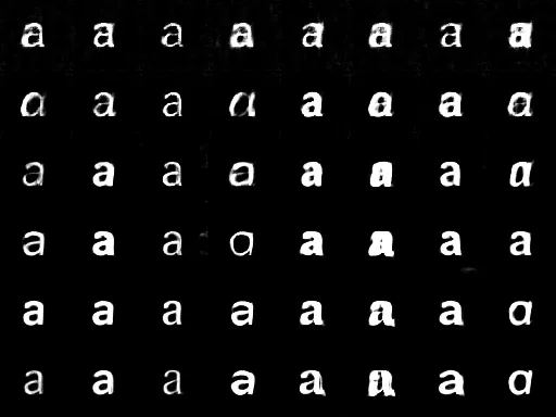
Budget in steps, not epochs. A few hundred glyphs make an epoch a handful of steps, so an epoch count carried over from a large dataset trains for almost no time at all.
Start small. A crisp 64-pixel model that interpolates smoothly is more useful than a soft large one, and a few thousand glyphs will not support a 256-pixel discriminator without it memorising them. Raise the feature count only as the dataset grows — past a certain point the model has more parameters than it has pixels to fit, and the generator collapses to a fixed pattern that ignores its latent input entirely.
The timings are measured rather than quoted: a 2017 Intel MacBook Pro under sustained load with the CPU thermally throttled, because that is the machine this runs on and a cool-start figure would be a different claim. Dataset size does not affect step time — a step costs one batch whatever the dataset holds, so growing it is free in wall-clock. And raising the batch size past 32 is slower rather than faster: the GPU is already saturated, and the larger batch just serialises.
Spherical, not straight
The interpolation walks a sequence of latent waypoints and loops back to the first, and the path between them is spherical rather than linear.
A straight line between two Gaussian latents passes through vector norms the model never saw during training. The midpoint of that line is shorter than either end, and the generator has no idea what to do with it — so morphs sag and wash out exactly halfway, which is the part anyone actually watches.
What it is not
Not a typeface, and never going to be. A GAN produces images, not outlines, and a raster of a letter is not something a type designer can work from.
What it produces is a space. The output is the walk through it.